Year-Over-Year Sales Analytics
Year-Over-Year Sales
Analytics
An end-to-end dashboard comparing 2023 against 2024. Without access to proprietary corporate data, I engineered a Python script to generate a realistic synthetic ledger, mapping out year-over-year growth, customer habits, and regional trends.
Most YoY reports stop at top-line revenue. I wanted to see the underlying mechanics-how specific cities, product categories, and top customers shifted from one year to the next. Since I didn't have access to a real company's private sales database, I built a Python engine using Faker and NumPy to simulate millions of realistic transactions, complete with seasonal logic and product category mappings.
The Methodology
1. Synthetic Data Engineering
Used Python libraries (Faker, NumPy) to simulate realistic customer and order behavior. I hardcoded specific logic blocks to ensure product categories mapped correctly to prices and seasonal buying habits.
2. Data Structuring
Formatted the raw simulation outputs into clean CSVs, ensuring all dates, primary keys, and data types were perfectly structured for relational modeling before they ever touched a BI tool.
3. Visual Analytics
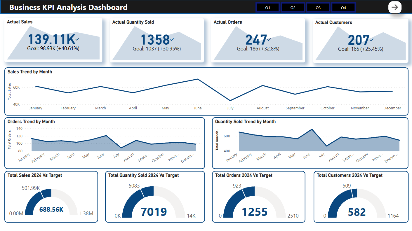
Built a three-page Power BI dashboard featuring dynamic mapping, custom hover tooltips, and gauge charts to actively track actual performance against simulated 2024 targets.
The Deliverables

Key Findings
The Pareto principle holds true.
Even in a synthetic model designed with random variance, the top 100 customers accounted for over 60% of total revenue. This proves why identifying and isolating VIP cohorts is more important than tracking raw traffic.
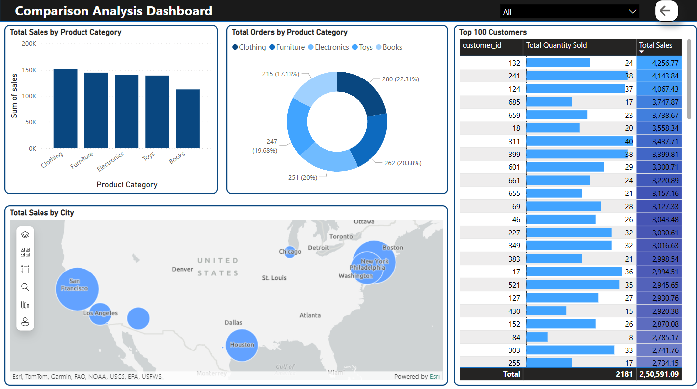
Geography dictates volume.
San Francisco, New York, and Houston heavily skewed the sales map. Drilling down into the Power BI map filters revealed that category dominance (like Electronics vs. Clothing) shifted drastically depending on the city.