
🏏 IPL Data Analysis (Season 2024 and 2025)
A data-driven project exploring player and team performances across the 2024 and 2025 IPL seasons — combining SQL, Python, Power BI, and Generative AI to break down everything from boundaries and catches to toss impact and review success.
🛠️ Tools & Technologies Used
- SQL (MySQL) – Used for slicing the main IPL dataset into filtered views for the 2024 and 2025 seasons.
- Python (pandas, matplotlib, seaborn) – Exploratory Data Analysis, player performance trends, season-wise insights.
- Power BI – Built a multi-page interactive dashboard with KPIs, slicers, trendlines, and maps.
- Generative AI (ChatGPT) – Assisted in ideation, error handling, SQL optimisation, notebook documentation, visual design, and storytelling.
🔗 Links
📁 Dataset
The project started with a large IPL Dataset covering all IPL seasons. Using SQL, I derived three filtered datasets specifically for the 2024 and 2025 seasons:
ipl_filtered_24_25.csv– Ball-by-ball data for the 2024–25 seasons onlyipl_player_stats_24_25.csv– Simplified version to track batter/bowler/wicket actionsipl_summary_24_25.csv– Match-level summary (toss winner, result, player of match)
📎 Original Source:
🎯 Problem Statements / Goals
This project wasn’t just about which team won more matches — it was about uncovering patterns that aren’t obvious casually, such as:
- How important is the toss — does winning it actually increase win%?
- Does batting position matter in scoring runs?
- Which players are consistent but overlooked?
- How successful are DRS reviews per team?
- What’s the typical target score range teams face in chases?
- Which teams are tactically better at bowling dot balls?
- Do some teams dominate in catches or commit fewer fielding errors?
- And lastly, in which stadium were most IPL matches played in those seasons?
🧪 Project Workflow
SQL Phase
- Used Filtering methods to create 3 tables from the master IPL dataset.
- Removed cancelled matches and playoff outliers where needed.
- Wrote queries to calculate:
Python + Jupyter Notebook Phase
- Loaded the 3 pre-filtered datasets exported from MySQL Workbench into pandas.
- Validated datatypes, fixed inconsistencies (e.g., nulls in “runs_target”, unknown fields).
- Season-separated stats and grouped analysis (2024 vs 2025).
- Built tables and visualisations for:
- Team win% (excluding cancelled matches).
- Catches per team (bar charts).
- Dot Balls bowled by Each Team (bar charts).
- Total Boundaries differentiated by number of 4s & 6s. (side-by-side bar charts).
- Toss-Winner Impact on Match Result (Pie-Charts).
- Comments and markdowns added to enhance storytelling.
Power BI Dashboard
Built a 4-page dashboard with interactivity and visual elements:
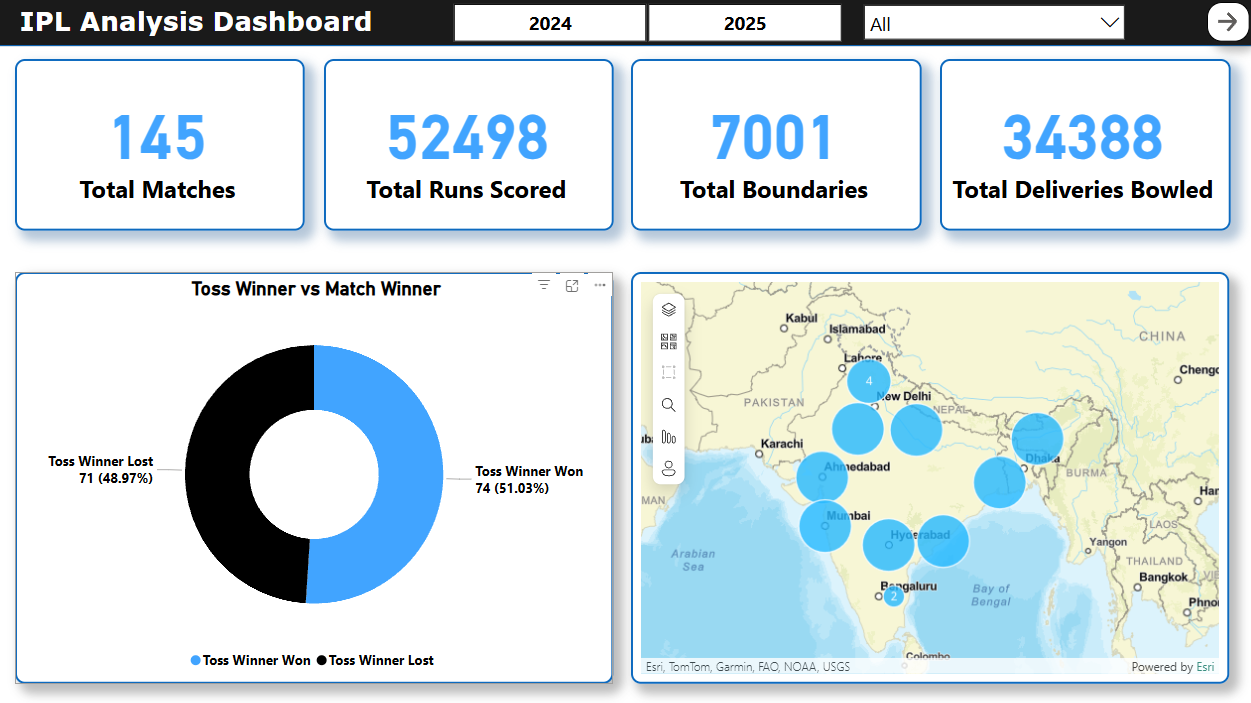
📄 Page 1: IPL Overview
- Total boundaries, matches, runs, deliveries (KPI cards).
- Team-wise venue map.
- Toss Winner v/s Match Winner Donut Chart.
- Slicers for seasons and teams.
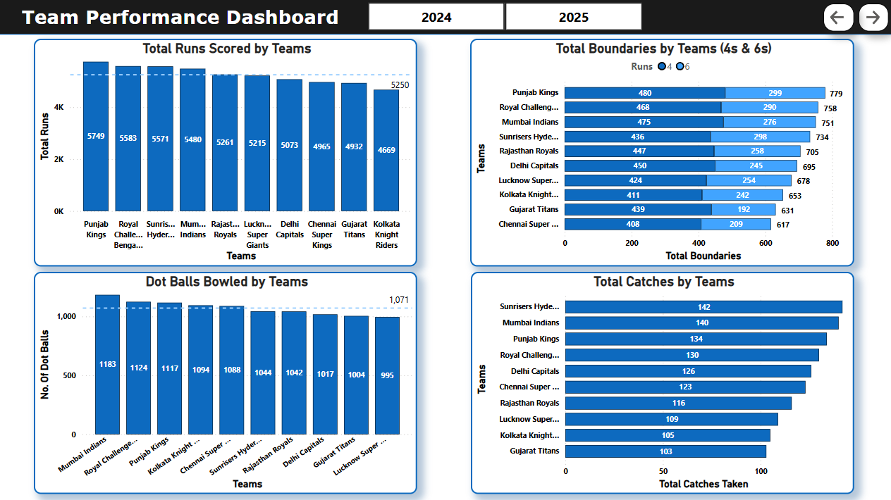
📄 Page 2: Boundary & Dot Ball Insights
- Total Runs scored by Teams.
- Total 4s and 6s by team.
- Dot balls bowled per team (per season)
- Total Catches taken by each team.
- Slicers for seasons.
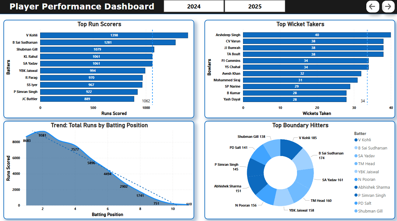
📄 Page 3: Batting Performance
- Trendline: Batting position vs runs scored.
- Donut: Top 10 boundary hitters
- Bar Charts: Top run scorers, wicket takers, i.e. Orange and Purple Cap Leaderboard.
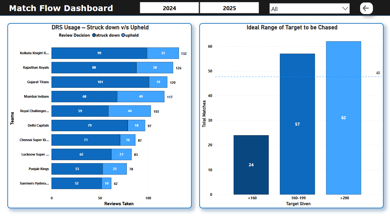
📄 Page 4: Match Behaviour
- Review system summary
- Target range distribution while chasing
✔️ Page navigation via buttons (no bookmarks/DAX required)
📊 Key Insights
- 🏏 Punjab Kings led in total catches in 2025.
- 🎯 Most teams had to chase targets of more than 200 runs.
- 🥇 V. Kohli, B. Sai Sudharsan had dominant batting performances.
- ⚖️ Toss winner didn’t always secure match wins — strategy mattered more.
- 🔄 Several matches had successful DRS overturns — DRS efficiency varies by team.
- 🎯 Dot ball count helped teams control run flow, especially in 2024.
💡 Things I Learned
This project taught me a lot — not just about cricket data, but about organising a full-stack data project from scratch:
- How to set up and clean real-world data in SQL.
- Structuring exploratory analysis in Python before designing visuals.
- Creating clean, slicer-friendly dashboards in Power BI.
- Avoiding visual clutter and focusing on what insights actually matter.
- Balancing aesthetics with interactivity (tooltips, maps, dynamic filtering).
- Using AI tools for efficiency and handling complex tasks easily.
📦 How to Explore
If you’re checking this project out:
- You can review the
.sqlfile to recreate the database - Use the Jupyter Notebook to experiment or modify visualisations
- View the Power BI
.pbixfile directly, or try the online published version