
🛍️ Sales Data Dashboard (2023 vs 2024)
A complete end-to-end data generation, cleaning, and visualization project comparing two business years (2023 vs 2024) through custom synthetic data. Built entirely in Python (Jupyter Notebook) and visualized using Power BI — combining storytelling with interactivity using dynamic slicers, maps, and custom tooltips.
🛠️ Tools & Technologies Used
- Python (pandas, Faker, NumPy) – Generated and cleaned 2023 & 2024 datasets using random logic and libraries.
- Power BI – Designed interactive dashboards with city/state maps, slicers, donut charts, KPI cards, tooltips, and bar graphs.
- Generative AI (ChatGPT) – Used as a co-pilot to debug scripts, organize logic, rewrite markdown, and brainstorm layout/design enhancements.
🔗 Links
📁 Dataset Description
This project doesn’t use real-world business sales data. Instead:
🔹 I first generated synthetic sales data for 2023 and 2024 using Python’s Faker and NumPy libraries.
🔹 Then saved them into two datasets:
🎯 Problem Statements / Goals
This project wasn’t just about revenue per year — it was about answering questions like:
- 🛒 Are certain product categories more dominant by sales or by total orders?
- 🏙️ Which cities contributed the most to overall revenue?
- 📈 How do trends change month-by-month across KPIs like Sales, Orders, Quantity Sold?
- 👤 Who are the top customers and how much are they contributing to our growth?
- 🧭 What is the business growth direction comparing 2023 and 2024?
🔄 Project Workflow
Python (Jupyter Notebook)
- Used
Faker,random, andNumPyto simulate customer/product/order behaviour. - Created logic blocks for 2023 and 2024 (product-category mappings, ID formats, etc.)
- Saved final outputs as
.csvfiles for Power BI import.
Power BI Dashboard
Built an interactive dashboard with 3 report pages covering:
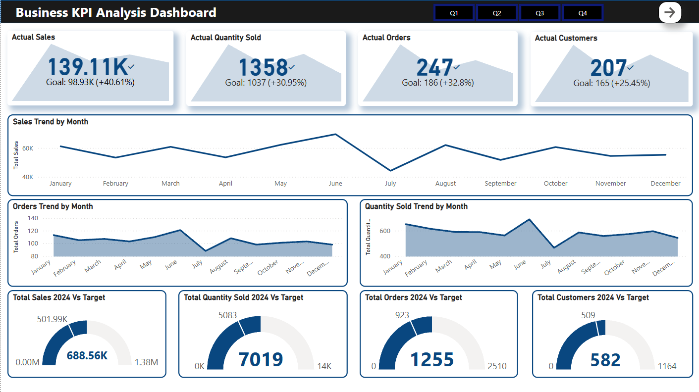
📄 Page 1: KPI Dashboard
- 📌 KPI cards: Sales, quantity sold, orders, customers
- 📈 Line charts: Month-wise trends
- 🎯 Gauges: Year-end vs target KPIs
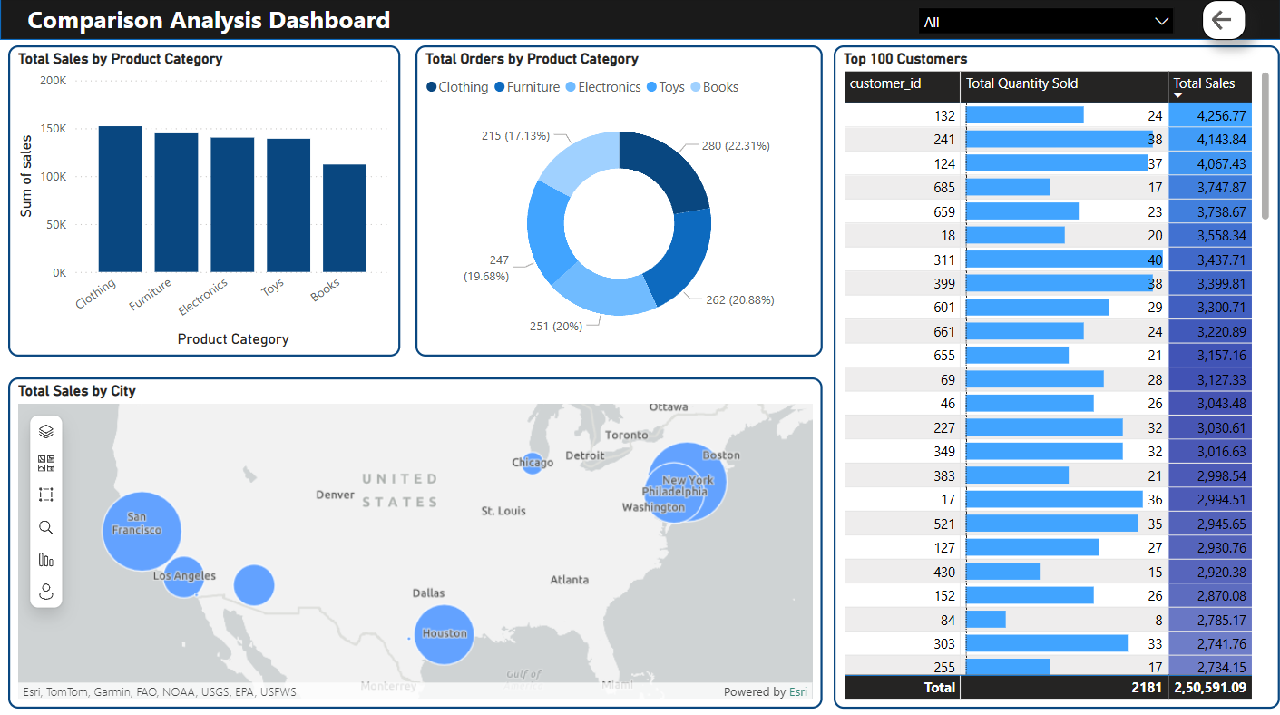
📄 Page 2: Comparison Analysis
- 📊 Sales by product category (bar)
- 🧮 Orders by product category (donut)
- 🗺️ City-wise sales (map)
- 🧑 Top 100 customers by sales and quantity
📄 Page 3: Custom Tooltip View
- Tooltip with Qtr-wise breakdown
- Appears on visual hover in dashboards

💡 Key Insights
- 📈 2024 saw a spike in both total customers and sales.
- 🧢 Clothing & Electronics dominated in sales and orders.
- 🗺️ San Francisco, New York, Houston led city-wise performance.
- 💎 Top 100 customers made up over 60% of revenue.
- 🎯 Most KPIs surpassed their original 2024 targets.
🚀 Things I Learned
- How to create realistic synthetic datasets with Python.
- Balancing logic complexity with data readability.
- How to format and clean data to be dashboard-ready.
- Designing Power BI dashboards that tell stories visually.
- Using AI as a fast-thinking assistant in exploratory and design stages.
📦 How to Explore This Project
- 📥 Download the datasets from the repo.
- 🐍 Explore the logic in the Jupyter Notebook.
- 📊 Open and analyze the Power BI
.pbixfile. - 🧭 Use filters/slicers in Power BI to explore dynamic trends.